Matplotlib 的使用
Matplotlib使用
import matplotlibmatplotlib.pyplot基础使用
import matplotlib.pyplot as plt¶Figure AxesImage AxesSubplot 区别
import matplotlib.pyplot as plt
import numpy as np

# Fixing random state for reproducibility
np.random.seed(19680801)
img = np.random.random((100, 100))
fig = plt.figure(dpi=200)
im = plt.imshow(img, cmap='gray')
ax = plt.gca()
print(fig, im, ax)
输出
Figure(1280x960) AxesImage(160,105.6;992x739.2) AxesSubplot(0.125,0.11;0.775x0.77)¶pyplot.rcParams属性设置
查看属性
import matplotlib.pyplot as plt

print(plt.rcParams.keys())
设置rcParams属性
import matplotlib.pyplot as plt

print(plt.rcParams.keys())
plt.rcParams.update({
    'font.family': 'STSong',  # 用宋体显示中文
    'axes.unicode_minus': 'False',  # 正常显示负号
    'figure.dpi': 200,
    # 'mathtext.fontset': 'stix'
})¶示例
示例一
import matplotlib.pyplot as plt

f, axes = plt.subplots(2, 3, num=f'图片标题')
ax1 = axes[0, 0]
ax2 = axes[0, 1]
ax3 = axes[0, 2]
ax4 = axes[1, 0]
ax5 = axes[1, 1]
ax6 = axes[1, 2]
axes = [ax1, ax2, ax3, ax4, ax5, ax6]
for ax in axes:  # 每个子图设置
    ax.set_xticks([]), ax.set_yticks([])  # 隐藏坐标轴数值
    ax.set_xlim([0, 1])  # s
    ax.set_title('image_title', fontsize=16, fontfamily='sans-serif')
    ax.set_xlabel('image_label', fontsize=14, fontfamily='sans-serif', fontstyle='italic')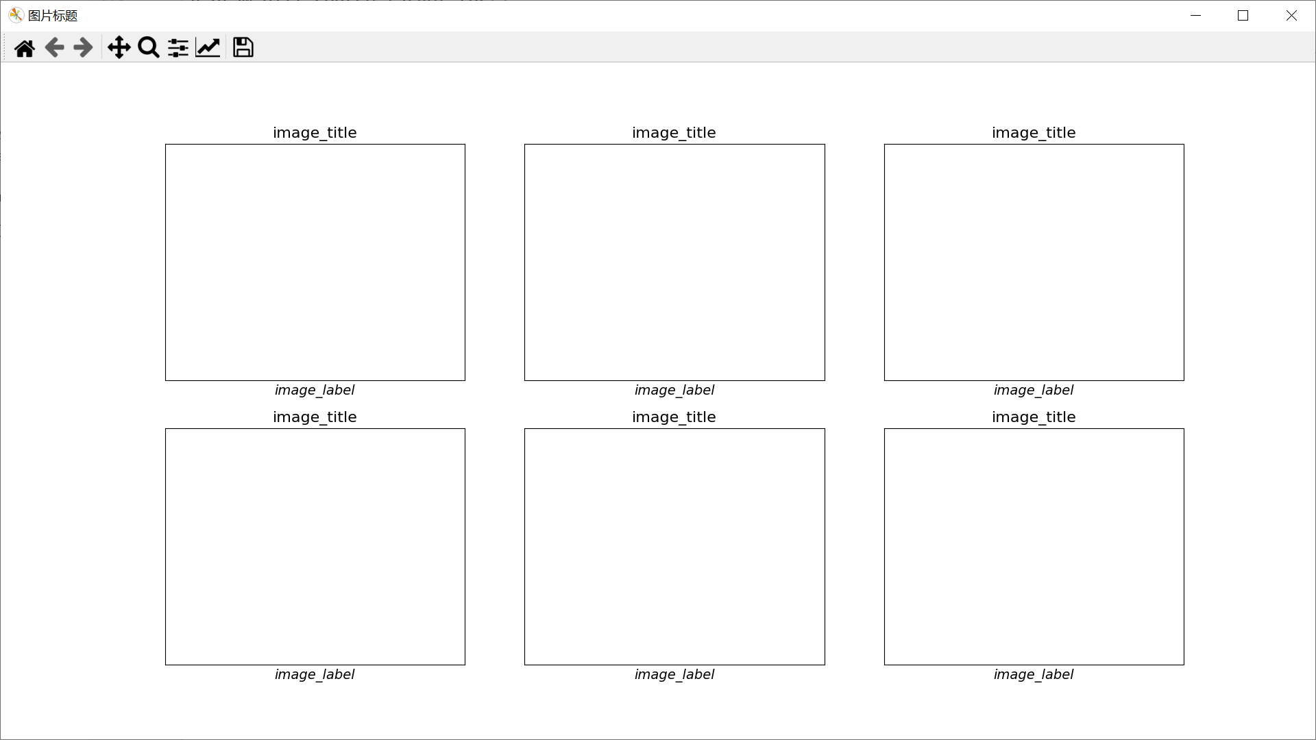
示例二
import numpy as np
import matplotlib.pyplot as plt

# First create some toy data:
x = np.linspace(0, 2 * np.pi, 400)
y = np.sin(x ** 2)
# Create just a figure and only one subplot
fig, ax = plt.subplots()
ax.plot(x, y)
ax.set_title('Simple plot')
# Create two subplots and unpack the output array immediately
f, (ax1, ax2) = plt.subplots(1, 2, sharey=True)
ax1.plot(x, y)
ax1.set_title('Sharing Y axis')
ax2.scatter(x, y)
# Create four polar axes and access them through the returned array
fig, axs = plt.subplots(2, 2, subplot_kw=dict(projection="polar"))
axs[0, 0].plot(x, y)
axs[1, 1].scatter(x, y)
# Share a X axis with each column of subplots
plt.subplots(2, 2, sharex='col')
# Share a Y axis with each row of subplots
plt.subplots(2, 2, sharey='row')
# Share both X and Y axes with all subplots
plt.subplots(2, 2, sharex='all', sharey='all')
# Note that this is the same as
plt.subplots(2, 2, sharex=True, sharey=True)
# Create figure number 10 with a single subplot
# and clears it if it already exists.
fig, ax = plt.subplots(num=10, clear=True)
¶散点图
import matplotlib.pyplot as plt

# 分别存放所有点的横坐标和纵坐标,一一对应
x_list = [1, 2, 3, 2]
y_list = [2, 1, 2, 3]
# 创建图并命名
plt.figure('Scatter fig')
ax = plt.gca()
# 设置x轴、y轴名称
ax.set_xlabel('x')
ax.set_ylabel('y')
# 画散点图,以x_list中的值为横坐标,以y_list中的值为纵坐标
# 参数c指定点的颜色,s指定点的大小,alpha指定点的透明度
ax.scatter(x_list, y_list, c='r', s=20, alpha=0.5)
plt.show()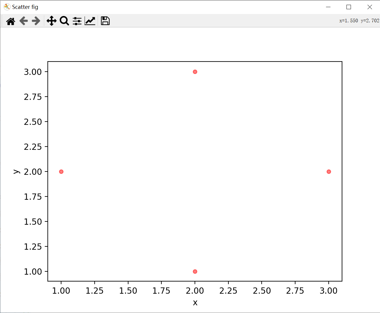
¶连线图
import matplotlib.pyplot as plt

#分别存放所有点的横坐标和纵坐标,一一对应
x_list = [1, 2, 3, 2]
y_list = [2, 1, 2, 3]
#创建图并命名
plt.figure('Line fig')
ax = plt.gca()
#设置x轴、y轴名称
ax.set_xlabel('x')
ax.set_ylabel('y')
#画连线图,以x_list中的值为横坐标,以y_list中的值为纵坐标
#参数c指定连线的颜色,linewidth指定连线宽度,alpha指定连线的透明度
ax.plot(x_list, y_list, color='r', linewidth=1, alpha=0.6)
plt.show()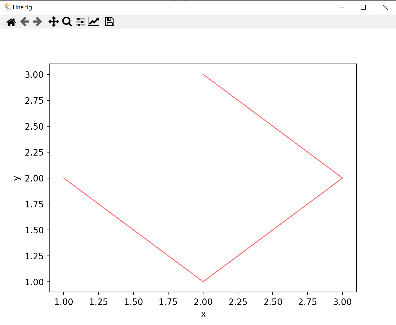
¶直方图
import matplotlib.pyplot as plt
import numpy as np
#数据
x_list = [1, 2, 3, 2]
y_list = [2, 1, 2, 3]
plt.figure('Bar fig')
ax = plt.gca()
ax.set_xlabel('value')
ax.set_ylabel('count')
#每个直方在x轴上的位置,代表着在x轴上的一个(些)绝对的位置,可以是整数或浮点数
xticks = np.arange(1, len(x_list)+1)
#每个直方的宽度
bar_width=0.5
#在xticks指定的位置画y_list指定高度的、width指定宽度的直方图
#edgecolor指定每个直方的边框颜色
#传入的xticks与y_list的长度必须相等!
ax.bar(xticks, y_list, width=bar_width, edgecolor='none')
ax.set_xticks(xticks)
#每个直方下边显示的label,传入的参数为一个列表,列表里可以是数字也可以是字符串
ax.set_xticklabels(x_list)
#横轴的显示范围,该范围小于xticks的范围会造成一部分直方显示不出来
ax.set_xlim(0,len(xticks)+1)
plt.show()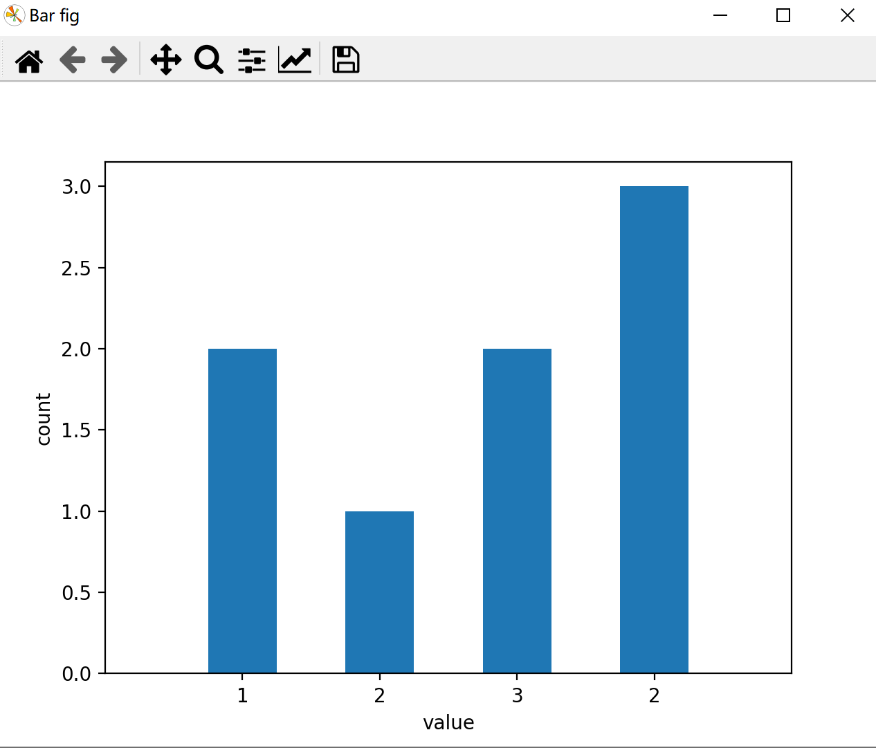
箱线图 matplotlib.pyplot.boxplot
- matplotlib.pyplot.boxplot(x, notch=None, sym=None, vert=None, whis=None, positions=None, widths=None, patch_artist=None, bootstrap=None, usermedians=None, conf_intervals=None, meanline=None, showmeans=None, showcaps=None, showbox=None, showfliers=None, boxprops=None, labels=None, flierprops=None, medianprops=None, meanprops=None, capprops=None, whiskerprops=None, manage_ticks=True, autorange=False, zorder=None, capwidths=None, *, data=None) [source]
import numpy as np
import matplotlib.pyplot as plt

x = np.random.normal(loc=0, scale=2, size=(500))  # 正态分布,均值0 方差2
plt.figure(dpi=200)
plt.boxplot(x, showmeans=True)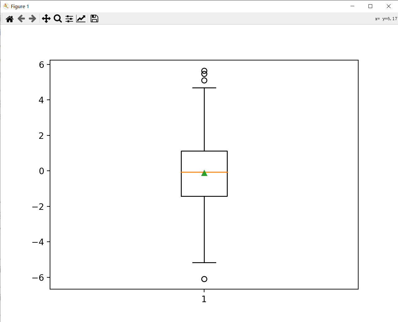
向量图(箭头图) matplotlib.pyplot.quiver
*matplotlib.pyplot.quiver(args, data=None, **kwargs)[source]
plt.quiver(x, y, u, v, color='r', angles='xy', scale_units='xy', scale=1)
'''
x 起点的x坐标 可为一系列点的x的numpy数组,y,u,v同
y 起点的y坐标
u x方向增量,即终点x' = x + u
v y方向增量,即终点y' = y + v
color 颜色
angles='xy'  保证x,y方向一致
scale_units='xy'  scale 缩放倍数,绘制长度=实际长度/scale
'''
使用示例
import matplotlib.pyplot as plt

plt.figure()
plt.quiver(5, 5, 3, 2, color='r', angles='xy', scale_units='xy', scale=1)  # scale=1
plt.quiver(5, 5, 3.2, 2, color='g', angles='xy', scale_units='xy', scale=2)  # scale=2  绘制长度=实际长度/scale
plt.quiver(5, 5, 3, 2, color='b', scale_units='xy', scale=1)  # 缺失angles='xy'  容易绘制与希望内容不符

plt.grid(True)
ax = plt.gca()
ax.set_aspect(1)
plt.xlim((2, 8))
plt.ylim((8, 2))  # 交换y方向,在缺失angles='xy'时,容易绘制与希望内容不符
plt.show()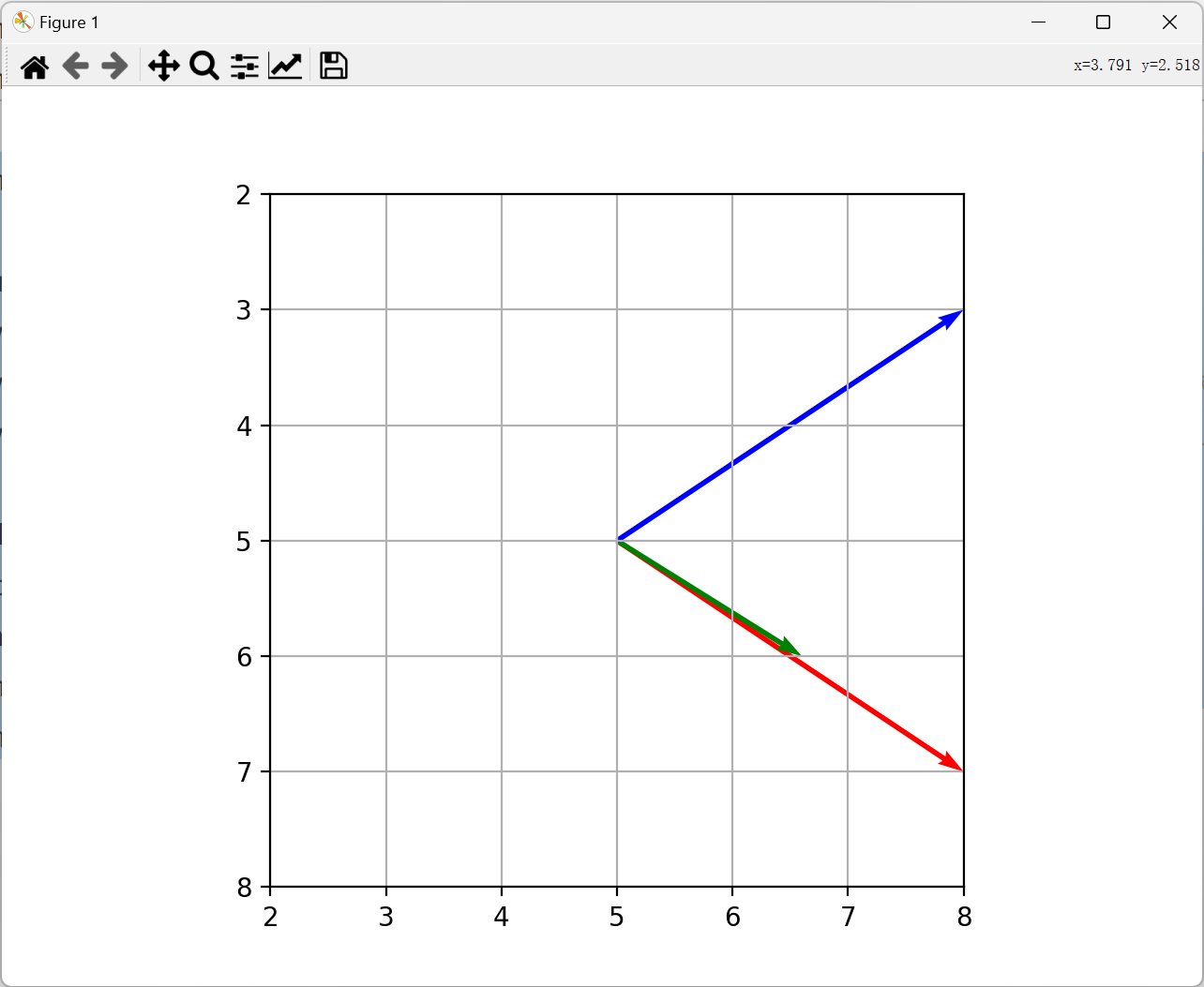
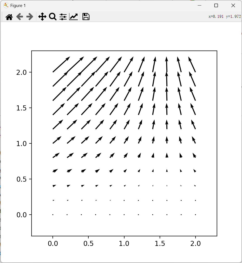
import numpy as np
import matplotlib.pyplot as plt

# Creating arrow
x = np.arange(0, 2.2, 0.2)
y = np.arange(0, 2.2, 0.2)
X, Y = np.meshgrid(x, y)
u = np.cos(X) * Y
v = np.sin(Y) * Y
# creating plot
fig, ax = plt.subplots(figsize=(5, 5))
ax.quiver(X, Y, u, v)
ax.axis([-0.3, 2.3, -0.3, 2.3])
ax.set_aspect('equal')
# show plot
plt.show()